Teal Colour
Teal
रंग कोड - 02468
An idyllic fusion of green and blue, Teal emanates royalty, flamboyance, and verve. This colour scintillates refreshing spirit conjured from the depth of her mysterious ocean beds. Adorning the walls of your home with this shade of Teal colour can instantly teleport you to the era of Royals.
This cool shade has a healing effect on your body, mind, and soul in relaxing showers. When complemented with pink, this shade creates magic in your living space.
अस्वीकरण: लागू किया गया वास्तविक दीवार पेंट रंग ऊपर दिए गए ऑन-स्क्रीन प्रतिनिधित्व से भिन्न हो सकता है। भौतिक रंग छाया कार्ड या पेंट किए गए नमूने को देखकर खरीद से पहले कृपया अपने रंग विकल्पों की पुष्टि करें।
Still confused ? Explore all our shades from our colour catalogue
हमारे पेंटिंग विशेषज्ञों के साथ अपने जीवन के कैनवास को पेंट करें
नेरोलैक एक्सप्रेस पेंटिंग सर्विस विशेषज्ञ द्वारा निःशुल्क साइट मूल्यांकन बुक करने के लिए नीचे दिया गया फॉर्म भरें
Trending Colour Shades
Find the Perfect Colour Shades for you walls

इस छाया में उत्पाद
अपने घर की सुंदरता को निखारने वाले पेंट को खोजने के लिए हमारे पेंट्स की व्यापक रेंज को ब्राउज़ करें

Neroalc Excel Mica Marble Strech Sheen & Mica Marble Stretch Sheen NXT
Nerolac Excel Mica marble stretch sheen Nxt & Mica Marble Strech Sheen is an extremely durable water...

Neroalc Excel Mica Marble Strech & Sheen Super
Nerolac Excel Mica Marble Stretch and Sheen Super is an extremely durable water based high performan...

Impressions Kashmir
Nerolac Impressions Kashmir Luxury Emulsion is a superior quality 100% acrylic emulsion based interi...

Beauty Gold Washable Plus
Nerolac Beauty Gold Washable Plus is an interior emulsion paint has a rich sheen finish, with highes...

Beauty Gold washable and Beauty Gold Washable NXT
Nerolac Beauty Gold Washable paint has a soft sheen finish, with excellent stain-cleanability at an a...

अपने आस-पास एक विशेषज्ञ पेंटर खोजें
Enjoy a holistic painting experience with Nerolac NxtGen Services
About Teal Colour
Teal Colour Designs, Shades & Combinations for Your Home
Teal Colour is a balanced mix of blue and green, usually placed between these two hues on the colour wheel. It is neither as bright as aqua nor as dark as many blue-greens, which makes it appropriate for several home decor styles. In interior design, teal is often associated with calm, clarity, and a composed sense of depth, so it can feel refined without appearing overly formal.
Because it carries the rich aspects of both blue and green, teal can look cooler or warmer depending on lighting, surrounding neutrals, and the finish you choose. For most homes, a planned approach helps teal look purposeful rather than heavy.
Key Characteristics of Teal Colour
-
Balanced depth
Many teal colour shades bring noticeable richness, yet they remain easier to live with than very dark blues or greens. This balance is the main reason teal works well as a feature wall colour. -
Dual undertone behaviour
Teal can lean more blue or more green depending on the mix. When it skews blue, it feels crisp and contemporary. When it leans green, it comes across warmer and a bit more earthy. -
Strong performance with structured neutrals
Teal also plays nicely with calm, classic neutrals like white, cream, light grey, taupe, and beige. These shades keep the room from feeling too busy. -
Dynamic appearance
Teal can look brighter in daylight and deeper in the evening. Rooms with mixed lighting often show these changes clearly, so sampling multiple areas of a wall is important.
Practical Uses of Teal Colour
-
Living rooms for a defined focal point
Use teal behind a sofa or TV unit to create a clear anchor wall. This approach keeps the rest of the room calm while still adding personality. -
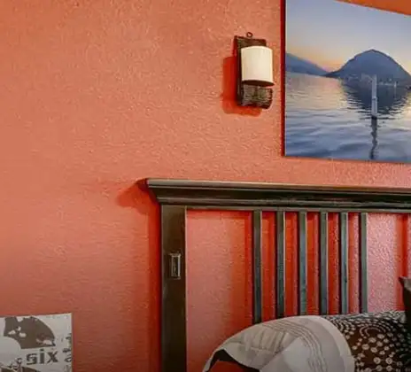
Bedrooms that need a calm colour
Teal works well on a headboard wall, especially when the remaining walls stay light. It can also suit larger bedrooms if the lighting is strong and the furniture is simple. -
Dining corners in open layouts
In open-plan homes, teal helps separate the dining area visually. It looks best when the dining zone has consistent lighting and minimal pattern overload. -
Study rooms and home offices
A teal wall behind a desk can make the space feel organised. If the room is small, keep teal limited to one wall and use light trims to avoid a closed-in look. -
Entryways and corridors
Teal can make transitional spaces feel designed rather than empty. Choose a shade that stays steady under artificial lighting, since these areas often have limited daylight. -
Interior and Exterior Applications of Teal
Teal colour shades are primarily used for interiors, where they create depth and visual interest in living rooms, bedrooms, and feature walls. In controlled architectural use, they can also be applied to exterior feature elements such as entry walls, balcony highlights, or shaded façades, where balanced blue-green tones add character without appearing too bold.
Teal Paint Choices for Your Walls
Selecting teal is easier when you first decide the role of the colour in your room: gentle background, balanced mid-tone, or deeper statement. When comparing shades in teal colour, check how the sample looks in the exact room at different times of day, because teal is sensitive to both sunlight and warm evening bulbs. It also helps to compare samples against flooring, curtains, and large furniture, not just against a white swatch card.
Subtle tones
- Pacific Bay: It suits spaces where you want a teal presence without high intensity. It works well in living rooms with good daylight and in bedrooms where you want colour that’s soothing.
Balanced tones
- French Sky: It is a practical option when you want a steady teal that does not become too moody at night. It pairs neatly with warm whites and light wood finishes, especially in modern apartments.
Deeper tones
- Splish Splash: It suits feature walls and defined zones, such as a dining nook or study wall. It can look especially good with lighter colours on the ceiling, and the right amount of lighting.
If you are reviewing teal colour different shades, keep the finish consistent while testing. A matte sample and a soft-sheen final coat may not look identical on a large surface.
Teal Wall Colour Combinations for Your Home
Teal colour palette planning becomes simpler when the wall finish is uniform, because it gives you a reliable base for selecting décor, fabrics, and companion shades. This is where a clear teal colour combination prevents over-styling and keeps the room visually calm. If you want a stronger look, build it through one planned pairing rather than adding several unrelated accents.
| Room/space | Recommended colour combination |
|---|---|
| Living room (TV wall / main focal wall) | Teal + Commadore – 2356 |
| Master bedroom (headboard wall) | Teal + Seaside – 2445 |
| Guest bedroom/reading corner | Teal + Clear Blue Sky – 4901 |
| Study/home office (feature wall) | Teal + Connoisseur Blue – 4236 |
| Dining nook (feature wall) | Teal + Seaside – 2445 |
| Entryway highlight wall | Teal + Clear Blue Sky – 4901 |
Teal + Commadore Colour Combination
This pairing suits living rooms that need a strong, clean focal wall. Keep the surrounding walls light and let the furniture remain neutral so the teal appears as the main design choice.
Teal + Seaside Colour Combination
Seaside supports teal with a calmer, coordinated feel, which makes it suitable for bedrooms and dining corners. Use teal on the feature wall and Seaside on an adjacent wall or a defined section to maintain balance.
Teal + Clear Blue Sky Colour Combination
Clear Blue Sky works well when you want the room to feel brighter, especially in smaller spaces. This combination can be a good option for entryways and guest rooms where you want a clean, welcoming finish.
Teal + Connoisseur Blue Colour Combination
Connoisseur Blue adds depth and structure, making it a strong choice for studies and work zones. Keep décor minimal and avoid too many additional colours so the walls remain composed.
Best Teal Shades for Accent Walls
If you are not fully sure about teal coverage, start with a single accent wall and evaluate it for a few days. Different teal colour shades can shift noticeably based on lighting, so the accent wall method reduces risk while still delivering a strong design effect.
| Recommended colour | Accent-wall location |
|---|---|
| Commadore | Behind the sofa (living room) |
| Seaside | Behind the bed (bedroom) |
| Connoisseur Blue | Desk backdrop (study) |
| Clear Blue Sky | Dining wall (open-plan) |
When you compare teal shades of colour for an accent wall, choose the smoothest wall surface and the most evenly lit wall. This helps the paint look consistent and reduces visible texture.
Simple Tips for Using Teal at Home
Teal is expressive, so a controlled plan usually looks better than applying it everywhere. If you are unsure, begin with one feature wall behind a bed, sofa, or dining setup, then keep the remaining walls in warm white, cream, or light grey. This creates depth without making the room feel intense.
Practical guidance you can apply:
- Pair teal with stable neutrals such as warm white, beige, taupe, or soft grey; neutrals help teal look clean rather than heavy.
- Plan lighting early; teal may look brighter in strong sunlight and deeper in dim rooms, so test a patch and review it at different times.
- Avoid using many saturated accents; one planned support shade and a few neutral decor choices usually look more refined.
- Keep patterns controlled; if curtains or rugs are heavily patterned, keep the wall styling simple.
If you want a stronger teal colour contrast, create it through clear edges and one deeper supporting shade rather than adding several bright colours that compete with the wall.
How Nerolac Can Help You Paint Your Walls Teal?
Teal is a deep, saturated colour, so a bit of preparation goes a long way. If the wall isn’t properly levelled and primed first, it can show up as patchy areas, uneven colour, or noticeable roller lines. Nerolac’s professional home painting service is set up to avoid those common finish issues by focusing on consistent surface preparation and an even application.
As part of the service, the team checks the wall area, how much natural light the room gets during the day, and what the space will be used for. Based on that, a teal shade is recommended that stays rich and balanced, so it adds character without making the room feel too heavy.
Plan, Design and Paint Your Walls With Nerolac Tools
Ready to plan your teal wall colour makeover?Use the tools below to explore shades, visualise rooms and estimate paint and budget.
Colour Visualiser
Use the Nerolac Colour Visualiser to try out different shades and textures from our colour and texture palette on the walls of our ‘room presets.’ You can also see how each colour will look under various lighting conditions, such as natural sunlight, cool white light and warm yellow light, before finalising a shade.
Colour Catalogue
Use the Nerolac Colour Catalogue to browse over 1,500 Nerolac wall paint shades. Search by colour name or code, or filter by colour family to quickly discover options that match your décor. Shortlist your favourite shades and pair them with the other Nerolac tools to finalise the perfect colour scheme for your home.
Paint Calculator
Use the Nerolac Paint Calculator to estimate the area to be painted and the required paint volume for your décor project. Enter wall dimensions, room count, and preferred product to get an approximate paint quantity and cost, helping you plan your project with greater
Frequently Asked Questions For Teal
What colour goes with teal walls?
Teal colour works perfectly with muted tones of blue and green or neutrals like white or beige.
Is teal colour warm or cool?
Teal colour is a cool colour because it belongs to the green and blue colour family.
Is teal a good colour for a bedroom?
Teal is a warm tone that gives out a serene blue-green tone, making it perfect for a bedroom. Teal colour adds warmth, solitude and energy to the space. It can also be used for accent walls or trimmings in a bedroom.
Is teal a neutral colour?
Teal is not a neutral colour. However, teal colour compliments neutral tones and furniture.
What colour curtains go with teal painted walls?
Neutral shades like white or beige add sophistication to curtains and teal colour walls. For a statement, golden or red curtains can add a dramatic effect to your space.
How do you style furniture in a room with teal walls?
Wooden furniture works well with teal colour. Heavy furniture also balances the traffic in a room with teal as the backdrop.
Can I use teal colour in a living room?
Teal colour is a bold and vivacious choice for an entire living room. It is recommended that teal is used for accent walls or highlight walls or in the bedroom area.
Does teal count as green or blue?
Teal is a mixture of green and blue but it has a higher intensity of blue in it.
How to get the Teal colour?
Teal is typically made by mixing blue and green, starting with equal parts and then adjusting - more blue gives a cooler teal, and more green gives a fresher teal.
Is Teal a good choice for accent walls?
Yes, teal is usually a strong accent-wall colour because it adds depth and definition without requiring the entire room to be coloured. It works best on the wall you want to highlight (behind a sofa, headboard, or console), while the remaining walls stay in lighter neutrals.
Can I use the Teal colour in the corridor?
Yes, but keep the application controlled because corridors often have uneven lighting. A lighter teal or a single feature wall with a light ceiling generally keeps the passage looking open, while still adding character.
Can Teal make my room feel more vibrant?
Yes, teal can add a more energetic, fresh feel, especially when the room has good lighting and clean supporting tones. If you want the colour to appear brighter, use lighter companion shades and keep decor choices simple so teal remains the main visual highlight.
Can Teal be used in rooms with limited natural light?
Yes, but it should be used carefully. In low-light rooms, keep teal to one wall and use lighter surrounding finishes so the space does not feel too dark.
How does Teal interact with decor colours?
Teal typically works well with whites, creams, beige, taupe, and soft greys. It can also pair with selected deeper blues or greens, as long as the overall palette remains controlled.
Create magic with our inspiring Two Colour Combinations!
-
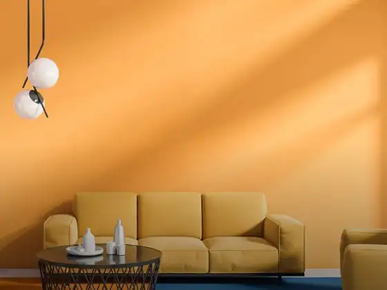
Orange And Lilac Colour Combination
-
Red And Brown Colour Combination
-
Yellow And Blue Colour Combination
-
Yellow And Green Colour Combination
-
Yellow And Orange Colour Combination
-
Yellow And Red Colour Combinations
-
Orange And Brown Colour Combination
-
Orange And Gold Colour Combination
-
Orange And Grey Colour Combination
-
Orange And Cream Colour Combination
-
Orange And Peach Colour Combination
-
Orange and Red Colour Combination
-
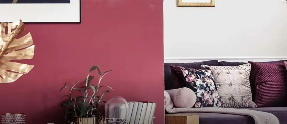
Orange And Purple Colour Combination
-
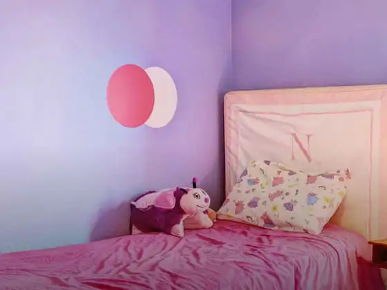
Orange And Pink Colour Combination
-
Orange And White Colour Combination
-
Orange And Neutral Colour Combination
-
Orange And Beige Colour Combination
-
Orange And Violet Colour Combination
-
Orange And Blue Colour Combination
-
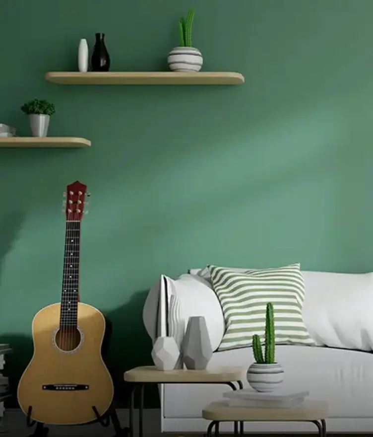
Orange And Green Colour Combination
Latest Happenings in the Paint World
Get some inspiration from these trending articles

Friday Colour to Wear – Lucky Colours, Astrology Meaning, Outfit & Wall Colour Guide

Thursday Colour to Wear – Lucky Colours, Astrology Meaning, Outfit & Wall Colour Guide

Tuesday colour to wear – Lucky Colours, Astrology Meaning & Outfit & Wall Colour Guide

Monday Colour to Wear – Lucky Colours, Astrology Meaning, Outfit & Wall Colour Guide

Wednesday Colour to Wear – Lucky Colours, Astrology Meaning & Outfit & Wall Colour Guide

What Is the Haldi Ceremony? Meaning, Decoration & Colour Guide
संपर्क में रहो
किसी और चीज को ढूंढ रहे हैं? अपनी क्वेरी छोड़ें और हम आपसे संपर्क करेंगे।
Popular Searches
-

Get in Touch संपर्क में रहो -
Store Locator Store Locator -

Download App ऐप डाउनलोड करें
×
संपर्क में रहो
किसी और चीज को ढूंढ रहे हैं? अपनी क्वेरी छोड़ें और हम आपसे संपर्क करेंगे।
